New Logo
To give the Cola Lab blog website a good start, I stayed up late using Photoshop to create a new logo. The inspiration for this logo comes from our main research direction—point clouds. Let’s take a look at this new logo.
Logo Meaning
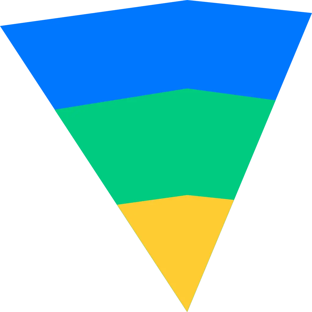
We know that when point clouds are projected, there is a point and many rays. The places where the rays extend have many planes, forming a triangular cone shape. So far, the shape of the new logo has been determined. We just need to find a point, extend two lines to form an acute angle, and then add a few segments to represent different planes to close this acute angle. This way, the shape is determined.
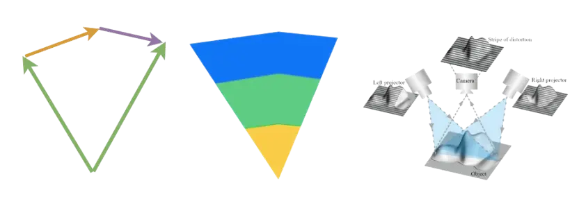 As for why I gave the logo three colors, it’s because in point clouds, we often use segmentation algorithms, and these algorithms typically use different colors to distinguish and represent segmented objects.
Vision
I hope that the Cola Lab can share some of my explorations in the fields of point clouds, digital architecture, and more, while also finding some like-minded friends. I believe that with our collective efforts, the popularization of digital architecture will be realized sooner.